Where do those paint names come from and how are they selected?
Each year the leading paint manufacturers list the top paint color of the year. 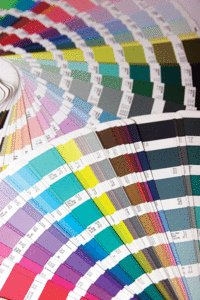
How is this selection process achieved?
Each fall the manufacturers release their “Color of the Year” usually with advice on how to completely renew your home with a fresh coat of paint. According to Benjamin Moore’s color and design expert, Andrea Magno, “We spend months researching and traveling around the world, attending design shows and picking up cues and influences from different industries, including fashion, art and even politics.
“Then the next step is bringing that information back and determining what the common threads are between these different disciplines and areas of the world.”
Over the past few years Sherwin-Williams spent months studying sleep patterns and spirituality before showing its “noir” collection.
This collection included such hues as Black Swan, Anchors Aweigh and Poised Taupe.
The selection process is very involved and can take up to a year.
According to Diana Olvera, color marketing manager at Behr, “Names can typically be sorted into four descriptive categories: visual, geographical, emotional and experimental.” Inspiration can come from nature, fashion, or pop culture. “We have a lot of fun creating experiential names like Strike a Pose, LOL Yellow, or Almost Famous, which give an abstract sense of a certain attitude or trend,” Olvera says.
Larger societies developed simple names for colors but smaller isolated cultures choice unusual names.
Both cultures developed the names in the same order.
The order was generally: Black, white, red, green, yellow, and blue with others like brown, purple and pink developed later — a hierarchy of color names.
“Culture is one of the biggest influences on color choice and it’s oftentimes intuitive,” according to Farrow & Ball’s head of creative, Charlotte Crosby.
She gives as example, the color red in China symbolizes good but in Western cultures it stands for anger and passion.
Recent research in this area demonstrates this hierarchy matches humans reactions to different frequencies in the visible spectrum.
Highly visual names include Coffee Beans and Wasabi both evoking visual, geographic and emotional responses.
Travel-inspired names such as Parisian Café and Kalahari Sunset are chosen to conjure up exotic, dream like places that calm and inspire.
The designers at Bountiful, Dwelling & Design in Easton and Higgins & Spencer in St. Michaels often use the colors of Coastal Living (blues and whites) for the Eastern Shore habitats.
Coconut Cream, Field of Daisies, and Summer Splash by Valspar conjure up delightful colors using a sensory connection.
Ace Hardware’s blue shade named Text Me, evokes a “happening now” sentiment aimed at the younger consumer, who will be buying paint for decades.
Leslie Harington, Ph.D., co-founder of the HUEgroup, a color intelligence company, revealed that color experts aim to trigger emotions like happy, calm, passionate by association of colors.
Geographical locations such as the French Riviera and Monte Carlo evoke enviable lifestyles.
Exotic and rich fabrics such as cashmere, mohair and silk recall texture and feel.
But nothing stimulates the color imagination like food, which adds taste to the mix of memories.
“Strawberry Parfait is good to taste, as well as look at,” says Leatrice Eiseman of the Pantone Color Institute. “Pink Flambé has an exotic connotation.”
Of course, there are colors that are created for specific rooms in the house and each company advises on the most appealing use of a color.
If all else fails, the companies open up naming to their employees.
For, example Benjamin Moore’s paint color named “Marilyn’s Dress,” seems to be reflecting on the late Miss Monroe’s billowy white dress in “The Seven Year Itch.” The color team opened up the naming to all company employees.
Marilyn Monroe, it turns out, used to work there, giving the soft gray its name.